Flex WebChat UI Release Notes
Info
This page includes the release notes related directly to Flex WebChat UI. Visit the Twilio Changelog and select "Flex" to see the Flex Changelog.
release date December 12, 2023
To get started with Webchat 3.0, see the Webchat 3.0 overview. This release is in Public Beta.
Webchat 3.0 works with Flex UI version 2.0.x and later.
This release includes breaking changes from Webchat 2.0. If you want to upgrade from Webchat 2.0, you must migrate to the new version.
- Webchat 3.0 is now deployed to your website using a deployment key, which shields your account information .
- When a new chat begins, Webchat captures a fingerprint of the user's browser and device, then validates that fingerprint with every new message to prevent spoofing.
- Webchat 3.0 is built on Flex Conversations , rather than legacy messaging .
release date September 15, 2023
- Fixed support for .me links in markdown in CDN version
release date September 15, 2023
- Fixed support for .me links in markdown in NPM version
release date June 15, 2021
- Upgraded Handlebars version to 4.7.7
release date May 11, 2021
- A fix to allow markdown links to be rendered correctly even if there is a space between the link text and the url it's linking to
release date FEB 26, 2021
- Characters being dropped intermittently when typing in the input field
release date FEB 24, 2021
- Added .app domain to the allow list
- Fixed the issue with WebChat not loading in mobile Safari
- Fixed the markdown code element overflow bug
release date JAN 13, 2021
- [axios] To version 0.21.1
release date DEC 9, 2020
- Markdown feature improvements including support for new elements (headings, ordered lists, code snippets, block quotes) and several bugfixes. Note , implementation now relies more on semantic HTML, so if you have styled generic html elements, keep an eye on how they look in chat.
Info
New versions of dependencies can contain changes in internal APIs that we do not document in release notes. If you're using any undocumented apis of upgraded dependencies, please review your code and update your customizations as needed. Any changes in undocumented api's are not considered breaking changes, however, if you are using them, this might break your customizations.
Example: This version of chat-sdk contains changes in internal API. To access channel attributes, channel.attributes is supported as per https://media.twiliocdn.com/sdk/js/chat/releases/3.4.0/docs/Channel.html and not channel.state.attributes.
release date OCT 27, 2020
- Upgraded lodash transient dependency in CDN bundle to remove a security vulnerability
- Fixed a bug with drag and drop into chat input field
- [handlebars] upgraded to version 4.7.6
release date SEP 16, 2020
- You can now set character limit of a message programmatically. Default limit is 32768 characters
MessagingCanvas.defaultProps.charLimit = 1000
- Size of CDN bundle has been reduced from 550kb to 390kb
-
Domain links with parameters, not separated by a slash, are now recognized as links. For instance:
http://flex.twilio.com?test=true.
release date SEP 01, 2020
Info
Web Chat UI API Reference for this version of Web Chat UI is available here
- Chat link parser now recognize domain and params not separated by a slash. For instance: " http://flex.twilio.com?test=true ".
release date JUN 23, 2020
- Image and file sharing for Web Chat channel in Pilot - Agents and Customers can now share images, documents and other files during a chat conversation. You can learn more about Chat attachments here .
-
A new boolean property in the
MainContainer
component called
showNotificationBar
which by default is
true. It's used to render the notification bar below the main header. You can find out more about the Notifications Framework here
-
CSS font style fix for title child (key=text) in
MessageCanvasTray
release date APR 27, 2020
- [handlebars] to version 4.7.3
Warning
Handlebars Dependency Upgrade: Handlebars provides templating for the strings exposed by Flex UI and Flex WebChat UI. In this release we are upgrading Handlebars to 4.7.3 to fix critical security vulnerabilities exposed in previous versions of Handlebars. This may be a breaking change if you use certain undocumented Handlebars features. You can find more information about this change atthe following link.
- We restructured our internal dependencies and stopped using a bundled dependency for our internal libraries. Developers can now manage their project dependencies using yarn .
- Improved chat message input rendering performance by debouncing store update on keypress.
- Fixed illegal unquoted character error when submitting WebChat messages via Enter button.
release date MAR 04, 2020
- Highlight URLs in chat messages only if they are not part of another string
release date JAN 16, 2020
- Issue with WebChat messages being marked as read
- Attempt to create a manager instance using incompatible redux store will now throw an error instead of string
-
MainContainermax-height set to80vhto make webchat accessible from smaller screens.
release date OCT 30, 2019
- Numbered List support for Markdown has been temporarily suspended due to some side effects found with the implementation. All other markdown options are still available as part of the released feature. Find out more about Markdown support here
release date OCT 07, 2019
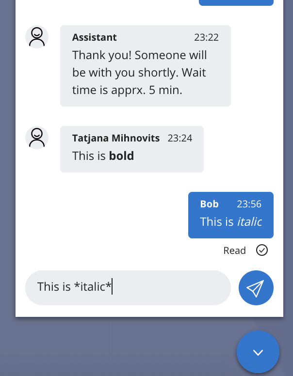
Markdown
- WebChat now has basic markdown support. A user can use Flex standard markdown syntax when typing a WebChat message and it will be displayed to agent and WebChat user as formatted text
- Messages with markdown syntax can also be sent with Programmable Chat REST API into the chat channel using the same Flex markdown syntax and they will displayed for Flex and WebChat users as formatted text.
- Flex user must be using Flex UI V1.4.0 or later
- Flex standard markdown syntax:
| Options | Syntax |
|---|---|
| Bold | **Bold** |
| Italic | *Italic* |
| Strikethrough | ~Strikethrough~ |
| Bullet list | * List * List * List |
| Numbered list | 1. One 2. Two 3. Three |
- The Message Input component's useLocalState flag is obsolete
- Typing indicator in chat canvas now shows count of people typing if that number is above 1.
release date AUG 29, 2019
-
DynamicFormemail validation now correctly supports 2-chars domains, subdomains.
release date AUG 12, 2019
-
Bundled code now transpiles to IE11-compatible version. If you're integrating Flex NPM package into your application, you also have to include polyfills for required features at the top of your application's entry point. For instance, in case of
create-react-app:
_10import 'react-app-polyfill/ie11';_10import 'react-app-polyfill/stable';
release date JUL 17, 2019
- twilio-chat from version 3.0.2 to version 3.2.3
- @material-ui/core from version 1.3.1 to version 3.9.3
-
Aria props properties to the following components to support accessibility:
-
MessageInput:
-
sendButtonAriaProps• AriaProps • Send button aria props ({ ariaLabel: "Send Message" }by default). -
textAreaAriaProps• AriaProps • Text area aria props ({ ariaLabel: "Enter your message here to get help" }by default)
-
-
MessageList:
-
listContainerAriaProps• AriaProps • List container aria props ({ ariaLive: AriaLive.Off }by default).
-
-
EntryPoint:
-
collapsedIconAriaProps• AriaProps • Collapsed icon aria props ({ariaLabel: "Click here to open Web Chat and get help."}by default). -
openedIconAriaProps• AriaProps • Opened icon aria props ({ariaLabel: "Hide Chat"}by default).
-
-
Example on how to set aria attributes:
_10FlexWebChat.MessageInput.defaultProps.sendButtonAriaProps = {_10 ariaLabel: "Send Message",_10 ariaLive: FlexWebChat.AriaLive.Polite_10};_10_10FlexWebChat.MessageInput.defaultProps.textAreaAriaProps = {_10 ariaLabel: "Enter your message here to get help",_10 ariaLive: FlexWebChat.AriaLive.Assertive_10};
-
Chat "Send message" button can now be themed with
theme.Chat.MessageInput.Button.
Example on how to change the icon for a text:
_18appConfig = {_18 <...>_18 Chat: {_18 MessageInput: {_18 Button: {_18 borderRadius: "5px",_18 width: "100px",_18 fontSize: "18px",_18 svg: {_18 display: "none"_18 },_18 ":after": {_18 content: '"Send Button text"'_18 }_18 }_18 }_18 },_18 <...>
- General Flex UI styles (like headers, paragraphs or links) are now applied only to HTML elements that have a class starting with Twilio or their direct descendants without any class
- CSS reset is no longer applied automatically.
- EntryPoint.tagline can now be set also via config's ComponentProps .
- Polyfills for IE11 support. Now WebChat is added to the page from CDN , it will work in IE11 with some minor style issues.
- Email validation in the pre-engagement form now allows numbers in the email.
-
Unused
AppState.tryGetmethod
@twilio/flex-webchat-ui@2.0.0
release date APR 1, 2019
Warning
This major version contains breaking changes
Info
This WebChat version works with any Flex UI version starting from version 1.0.0
-
We have added a character limit of 32kB to
MessagingCanvas.Users will see a character limit notification and message submit will be disabled if the limit is reached. TheSendMessageaction will validate the character limit and fail the action if the limit is reached. -
Requiredvalidation in the pre-engagement form was fixed. Users will not be able to submit the form if all required fields are not filled. - We have fixed several issues causing chat messages to be sent or rendered twice.
-
Breaking change:
Set
predefinedMessagedefaultProp toMessagingto display and customise a predefined initial message to the user. It is set to be displayed by default, but can be customized or turned off completely. Read more about how predefined message is used in Installing and using Flex WebChat -
Added
sdkOptions.chatkey to configuration object that can be used to pass options to chat SDK during initialization. -
Breaking change:
New function
Twilio.FlexWebChat.renderWebChatadded to initialize and render WebChat automatically. To create and render WebChat automatically (without configuring anything). Read more about ways to initializing and configure WebChat in Installing and using Flex WebChat . -
We have added an
emailtype field to the pre-engagement form . Data entered in that filed by the user will need to pass email validation to be submitted.
-
Breaking change:
Global
Twilio.Flexrenamed toTwilio.FlexWebChat. -
Breaking change:
Twilio.FlexWebChat.createWebChatnow only creates an instance of WebChat, but does not render it automatically. UseTwilio.FlexWebChat.renderWebChatto render automatically (instead ofcreateWebChat). Read more about ways to initializing and configure WebChat in Installing and using Flex WebChat . -
Breaking change:
We have removed
configure()method from returnedTwilio.Flex.createWebChatobject. Usemanager.configurationmember to set the configuration. -
Breaking change:
We have removed a default pre-engagement form from the out-of-the-box WebChat experience. Now
startEngagementOnInitby default istrue, and the defaultpreEngagementConfigis removed. Read about how to add a pre-engagement form in Pre-engagement and context -
Breaking change: We have changed the following component props of the
EntryPointcomponent:-
hideTaglineWhenExpanded- choose whether to hide thetaglinewhen chat box is expanded. -
iconClosed- name of the icon to be shown when chat box is closed. -
iconExpanded- name of the icon to be shown when chat box is expanded. -
tagline- tagline content.
-
-
We have also removed the following EntryPoint props in favour
EntryPoint.Containerdefined in the colorTheme object:-
entryPointStyle -
entryPointBorderStyle -
entryPointClassName -
widgetClassName -
entryPointSize -
entryPointLocation -
bottom -
right -
background -
color
-
-
Breaking change:
Added footer text as an attribute to
pre-engagement config
. Now use
preEngagementConfig.footerLabelto set it. To style pre-engagement form footer text, usePreEngagementCanvas.Footerin colorTheme object . -
logLevelby default is set toerror. -
Breaking change:
Chat's
MessageInputnow useslocalStateby default. This will allow the developer to store the message input value in the component state instead of the Redux state. Please note:MessageInput.defaultProps.useLocalStateshould be set tofalseif there's the intention of changing the input value using theSetInputTextaction. -
Group engagement stage constants in an Enum
EngagementStage -
Breaking change:
setEngagementStage()method has been removed from returnedTwilio.Flex.createWebChatobject. Engagement stage is determined by configuration and chat state. -
We have removed the following unused config options:
-
Config.canvasBottomprop -
Config.postEngagementConfigprop -
Config.timeoutEngagementConfigprop -
SessionState.sessionDataprop -
SessionState.waitingTimeoutSecondsprop -
SessionState.preEngagementReadyprop - Engagement stages
- Session Actions
-
@twilio/flex-webchat-ui@1.2.0
release date JAN 11, 2019
- Values for multiple fields in the pre-engagement form cannot be set
-
Name of the agent was not shown as
message senderafter the chat was completed - TypeScript definitions for TS based projects are broken
- WebChat fails to load if the chat channel has been deleted
- You can now use a custom redux store with WebChat
_23const reducers = combineReducers({_23 flex: WebchatReducer,_23 app: appReducer_23});_23_23const store = createStore(_23 reducers,_23 compose(_23 applyWebchatMiddleware()_23 )_23);_23_23FlexWebChat.Manager.create(config, store)_23 .then(manager => {_23 ReactDOM.render(_23 <Provider store={store}>_23 <FlexWebChat.ContextProvider manager={manager}>_23 <FlexWebChat.RootContainer />_23 </FlexWebChat.ContextProvider>_23 </Provider>,_23 document.getElementById("container")_23 );_23 });
@twilio/flex-webchat-ui@1.1.0
release date DEC 19, 2018
-
Fixed
selectItemtype in pre-engagement form by passing the missing value prop toSelectand fixed the styles for the same. -
Fixed the container width of
DynamicFromfor webchat forms.
-
The
startEngagementOnInitoption now disables pre-engagement form
-
User's friendly name default to
Anonymousand can be defined through context argument asfriendlyNamefield
Info
New GA version of the Flex WebChat UI has been released and is now available on NPM
- @twilio/flex-webchat-ui@1.0
-
New configuration options required in the application configuration:
-
accountSid- Account SID where Flex is running -
flexFlowSid- Flex Flow SID created at onboarding for chat
-
-
Configuration options
startEngagementUrlandserviceBaseUrl
-
Individual module files in the NPM module removed. All sources bundled into a single module bundle file referenced by the
mainfield in package.json.
-
Theming was reworked and config parameters changed. User now has 4 distinct levels available to theme their application.
-
Not specifying a predefined theme, in that case
BlueMediumThemeis chosen automatically. -
Specifying predefined theme - either
colorTheme:"DarkTheme"orcolorTheme: {name: "DarkTheme"}. Available themes areMediumTheme,DarkTheme,BlueMediumThemeandBlueDarkTheme. A predefined theme specifies base colors used and also whether the theme is considered light or dark, which influences text and hover colors unless they are specifically changed. -
Overriding all or a selection of colors and/or the lightness of the theme that was set by the predefined theme (note, specifying predefined theme was not compulsory, but in
BllueMediumThemewas then used as default).-
colors - variables
base1..base11are colors provided by the predefined theme that set the tone of the theme. User can override all (preferred) or some of those colors. User can also override any of the theme independent hardcoded colors like for example the red color of hangup button.-
Available colors to override are:
_10base1, base2, base3, base4, base5, base6, base7, base8, base9, base10, base11, defaultButtonColor, lightTextColor, darkTextColor, buttonHoverColor, tabSelectedColor, connectingColor, disconnectedColor, notificationBackgroundColorInformation, notificationBackgroundColorSuccess, notificationBackgroundColorError, notificationBackgroundColorWarning, notificationIconColorError, notificationIconColorWarning, userAvailableColor, userUnavailableColor, errorColor,
-
- light - Default text color, hover colors and rule of which base color is chosen for SideNav and MainHeader depend on this boolean.
-
-
The above mentioned parameters together with the built in
color -> component css propsmapping result in final theme where each component has a set of color specific css props. Should this not suffice there is a final step of providingoverridesproperty that allows for overriding any parts of this result. Documenting that object is beyond the scope of this changelog, it is easiest to just monitor that object in debugger and decide on what params to change.
Examples:
-
Not specifying a predefined theme, in that case
_20// Picks the default blue dark theme_20config.colorTheme = "BlueDarkTheme";_20// Picks dark theme, changes all of its base colors to new ones and tells the system that we still expect it to take the theme as dark (light parameter)_20config.colorTheme = {_20 name: "DarkTheme",_20 colors: {_20 base1: "blue",_20 base2: "orange",_20 base3: "yellow",_20 base4: "black",_20 base5: "white",_20 base6: "pink",_20 base7: "red",_20 base8: "blue",_20 base9: "brown",_20 base10: "black",_20 base11: "white"_20 },_20 light: false;_20}